
What is Issue?
Power Apps provides the way to display notification when some operation succeeded or there is any error, warning or just to show some information. We can use Notify() function which displays like banner on top of the app.


But sometime user don’t like this way to show notification. Is there any way to make it more fancy?
The Reason-
We can achieve the fancy Notification using multiple controls like containers, labels. But for each screen it will be repetitive task to implement this on each screen. How we can make it reusable, configurable and more generic?
Solution-
Power Apps has ability to create reusable components using Component Libraries or PCF controls. You can refer the this blog to create reusable Component Libraries.
Let’s see how we can leverage the Component Library and create custom Component.
Go to the Components Tab of your Power App in App Editor.
- Create new Component “GenericNotify”.
- Add Gallery
- Add Container in Gallery
- Add controls like Icons, timer, Label, etc. in Container.
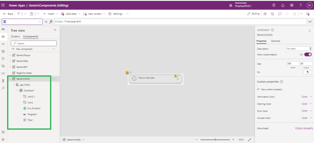
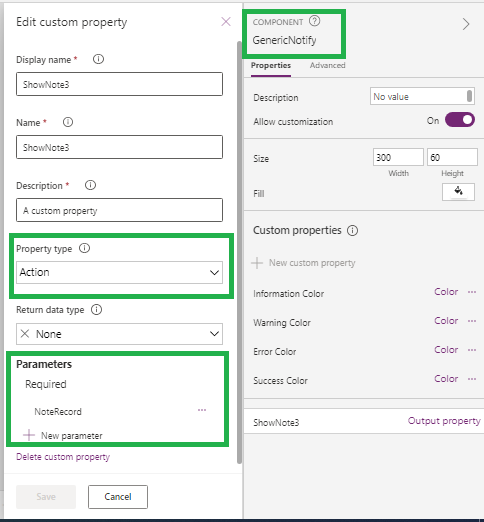
Select GenericNotiy Component and add custom property (Name: ShowNote3, Type : Action) with required Parameter “NoteRecord”(Data Type : Record).
Set NoteRecord with JSON-
{Text:"This is Test Note",Type:"Info",Timeout:5000}
This will ensure the valid Record schema to be set from App where we are going to use this custom control.
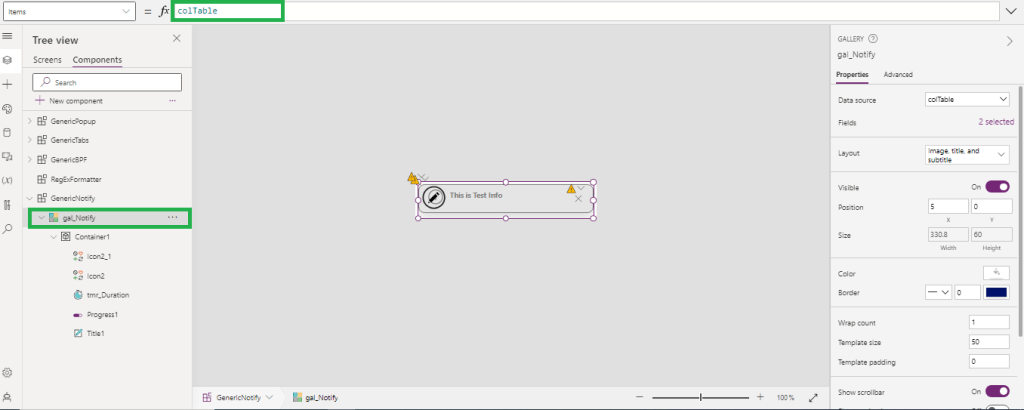
On ShowNote3 custom property, collect the record received in parameter NoteRecord in collection. let’s say colTable.


Now, we have Collection and Collection schema that I can use in the gallery control.
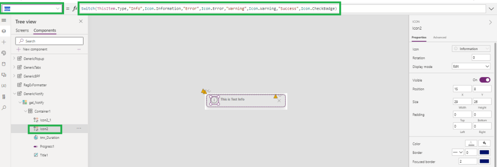
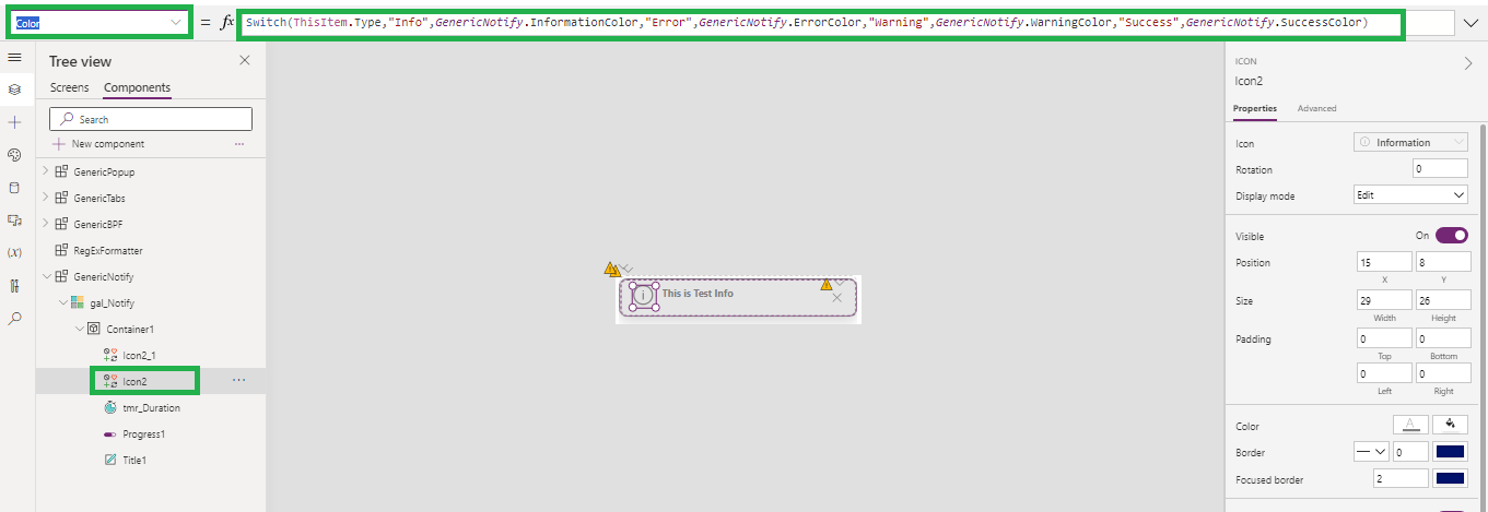
Set the icon and Icon color based on the Notification Type.
For Icon-
Switch(ThisItem.Type,"Info",Icon.Information,"Error",Icon.Error,"Warning",Icon.Warning,"Success",Icon.CheckBadge)
For Color, we can use the custom properties (Type: Input, Data Type :Color) of custom control. (InformationColor, WarningColor,ErrorColor,SuccessColor).
Switch(ThisItem.Type,"Info",GenericNotify.InformationColor,"Error",GenericNotify.ErrorColor,"Warning",GenericNotify.WarningColor,"Success",GenericNotify.SuccessColor)
It makes this notification more configurable from App.
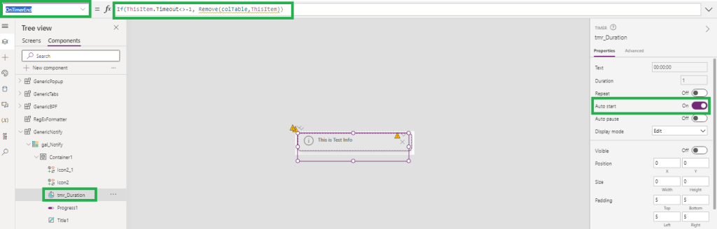
To set timeout property of notification, use timer.
Set timer duration with current record timeout value-
If(ThisItem.Timeout>0,ThisItem.Timeout,1)
And onTimerEnd, notification should be vanished from screen. To do this, remove current record from collection colTable
If(ThisItem.Timeout<>-1, Remove(colTable,ThisItem))

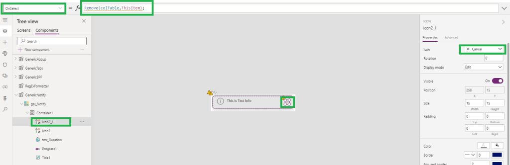
On click of Cancel, Notification should be closed. Similar to OnTimerEnd, remove current record from collection colTable.
Remove(colTable,ThisItem);
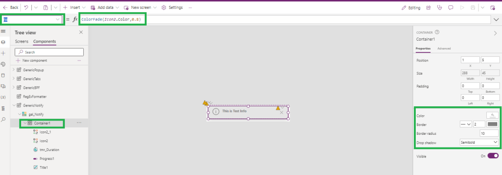
Set the container color based on the Icon color(which is depends on the NotificationType of current record).
ColorFade(Icon2.Color,0.8)
Set Notification Text in lable (Title1 as shown in image) and set color similar to Notification Icon.
Text –
ThisItem.Text
Color –
Icon2.Color


After doing some basic setting on each control in custom control, save it and use it in app.
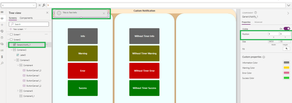
Add Custom Control in App and set the position where you want to show the notification.
- For Top-Left set X=5 and Y = 5
- For Top-Center Set X = (Parent.Width/2)-(Self.Width/2) and Y=5
- For Top-Right Set X= Parent.Width-Self.Width -5 and Y=5
- For Bottom-Left- X=5 and Y= Parent.Height-Self.Height-5
- For Bottom-Center X = (Parent.Width/2)-(Self.Width/2) and Y= Parent.Height-Self.Height-5
- For Bottom-Right X= Parent.Width-Self.Width -5 and Y= Parent.Height-Self.Height-5
- Height of the Control should be based on the number of Notification, so Height=52*CountRows(colTable) . 52 is Notification height.

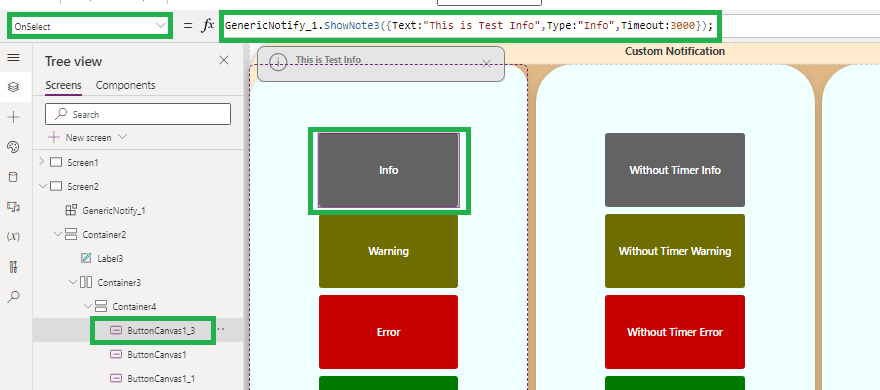
In App, Call the ShowNote3 function and pass the record while calling function.
Suppose on Button onSelect event I want to show information.
GenericNotify_1.ShowNote3({Text:"This is Test Info",Type:"Info",Timeout:3000});
If you don’t want to hide notification automatically pass Timeout : -1
GenericNotify_1.ShowNote3({Text:"This is Test Info",Type:"Info",Timeout:-1});

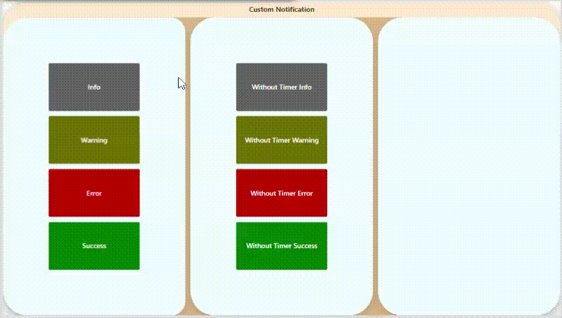
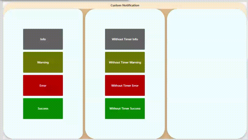
Demoes below-


Now this Custom control can be reused in multiple screens and apps.
Hope this will help…
Enjoy MS CRM!!!
Follow on Facebook- FB: MSCRM16Tech
 CRM 16 Tech